INGLÉS PARA FINES ESPECÍFICOS Grupo tarde B _ Profª Barbara Zubieta Jaren
主题目录
-
-
-
Curso Académico 2024-25 INGLÉS PARA FINES ESPECÍFICOS.
Description of the Course: English for Specific Purposes (Statistics)
This course is a tailored program aimed at second-year university students specializing in Statistics, focusing on the development of English language skills within a professional and academic context. Designed to address the specific linguistic needs of statisticians, the course equips students with the tools to analyze, communicate, and present statistical data effectively in English, ensuring they are prepared for international research and collaboration opportunities.
Who is this course for?
This course is intended for second-year university students in Statistics who want to: Improve their ability to read, write, speak, and listen in English within a statistical context. Gain confidence using English in academic and research environments. Learn how to present and explain statistical data clearly and professionally. What will you learn? By the end of this course, you will: Understand and use essential statistical terminology in English. Analyze and interpret graphs, tables, and datasets with accuracy. Write effective research reports and summaries. Deliver professional presentations of statistical findings using visual aids. Participate in group discussions and projects, giving and receiving constructive feedback.
How is the course structured?
The course combines interactive and practical learning to keep things engaging and relevant: * (Check the GEA file attached, please)
COURSE DISTRIBUTION:
Seminars (57.5%): Discussions, activities, and guided exercises on statistical topics in English.
Practical Classes (12.5%): Focused practice in grammar and vocabulary, reading, writing, and speaking about statistics.
Fieldwork Assignments (30%): Analyze real-world datasets and present your findings.
How will you be evaluated?
You’ll have two options for evaluation:
Combined Assessment: Continuous assessment (at least 35% of your grade) based on participation, assignments, and projects. Final exam to test your overall proficiency. Your final grade will be the weighted average of these two components:
- SPEAKING/WRITING PROJECT (30%) + CLASS / HOMEWORK (10%) = 40%
- EXAM ON THE UNITS COVERED IN CLASS = 60%+
Final Exam Only: If you prefer, you can rely solely on your performance in the final exam, but note that this option may be more difficult than having an ongoing assesment.
- FINAL EXAM ONLY ON THE UNITS COVERED IN CLASS: 100%
Class Attendance:
Make sure you register your class attendance every day. Go to the 'Class Attendance' section to register your attendance, please.
Schedule:
-
-
-
Unit 1 _ Downloadable

-
READING:
Sequels and Their Success: A Statistical Perspective.
Sequels are movies that continue the story of an earlier film. In 2024, 16 out of the 20 highest-grossing films were sequels or prequels. For example, the most critically acclaimed sequel was Dune: Part 2, while Inside Out 2 earned the most revenue. These statistics highlight how sequels dominate the film industry.
Trends and Data in the Film Industry
Since the early 2000s, there has been a noticeable increase in sequels, remakes, and prequels.
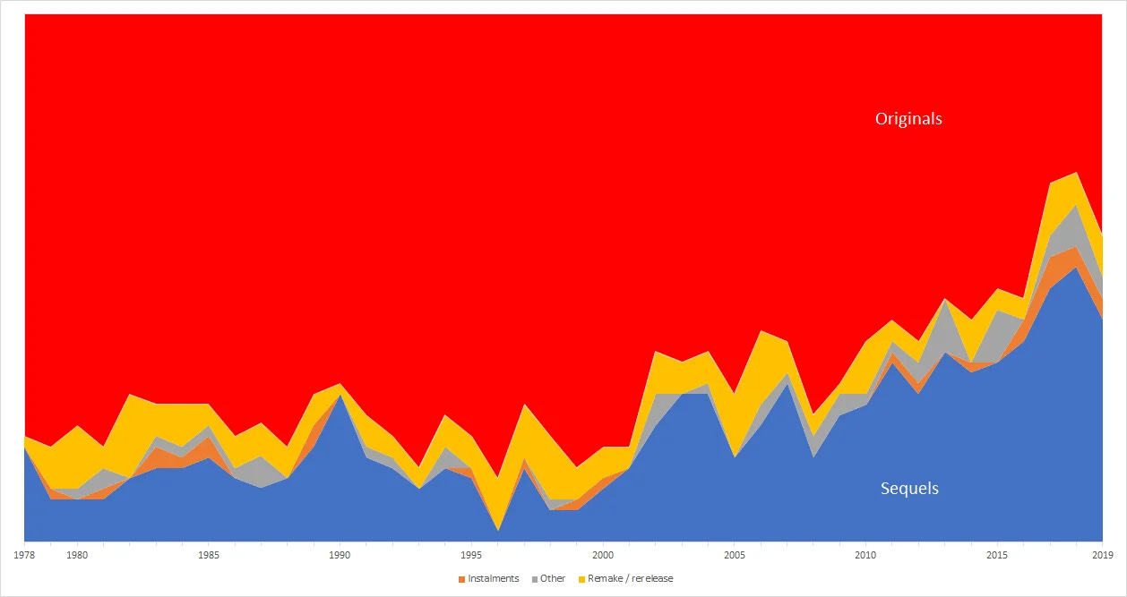
“Proportion of Original Films in the Worldwide Top 50 Grossing Films, 1978-2019” Source: u/spicer2 on Data Is Beautiful
They often represent a large percentage of the highest-earning films each year. Several factors explain this trend:
1. Market Trends: Improved home entertainment options have shifted viewing habits.
2. Industry Consolidation: Fewer studios mean less variety in content.
3. Profit Maximization: Studios prioritize high-revenue projects.
4. Replication: Companies attempt to replicate the success of previous hits.
Analyzing Success Using Data
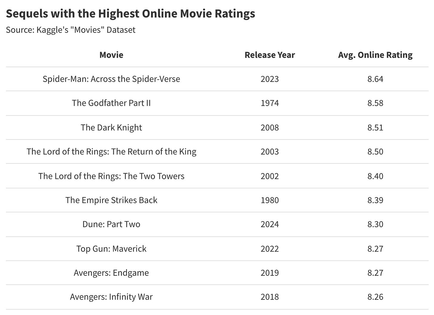
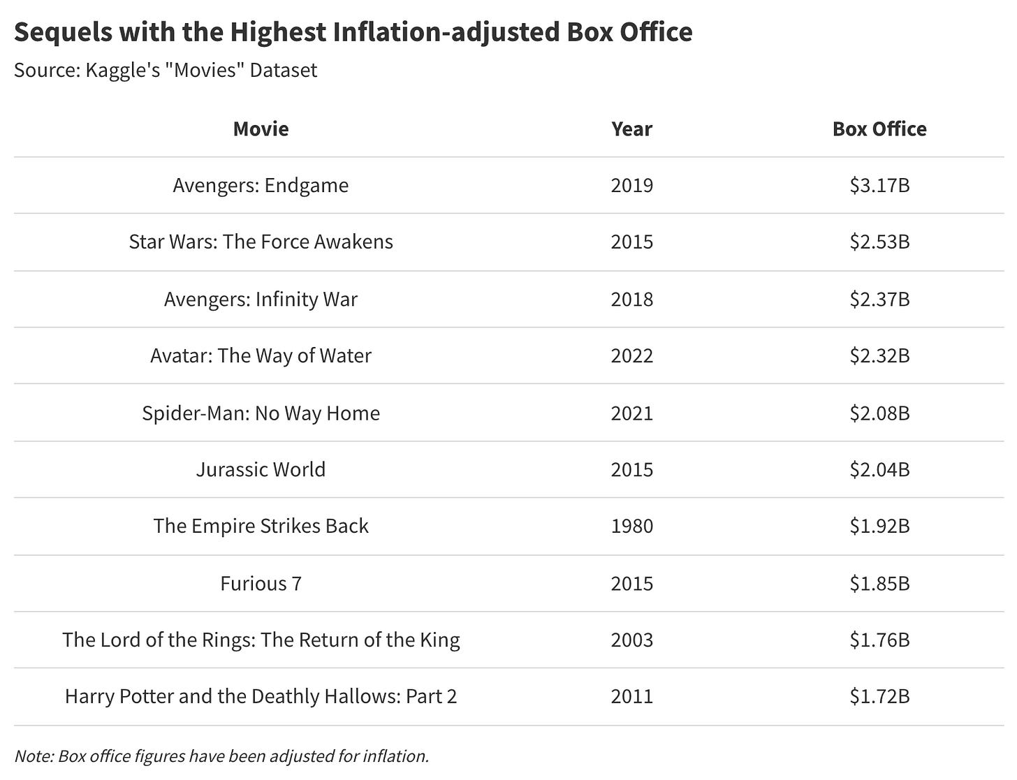
To identify the greatest sequels, analysts often rely on three key metrics:
1. Audience Ratings: Collected through platforms like IMDb or Rotten Tomatoes.
2. Box Office Revenue: The total income generated by ticket sales.
3. Awards: Recognition from organizations like the Oscars.
Audience Ratings
Ratings are subjective data points that measure public opinion. For instance, highly rated sequels like The Dark Knight or Avengers: Endgame received strong reviews, which contributed to their cultural impact. However, ratings can also include outliers or biases, which should be considered when interpreting the data.
Box Office Revenue
Revenue is a quantitative variable used to evaluate a film's financial success. For example, successful sequels often generate more revenue than their predecessors, creating a trend of increasing returns. However, there are also cases where sequels underperform, resulting in financial losses.
Awards as Qualitative Data
Awards serve as qualitative indicators of a movie’s critical success. However, not all popular sequels win awards, and not all award-winning sequels perform well commercially. This discrepancy highlights the importance of analyzing multiple data sets.

Statistical Patterns in Sequels
Recent data suggests that successful sequels, like Spider-Man: Across the Spider-Verse or Top Gun: Maverick, combine strong audience approval and high revenue. This alignment of qualitative and quantitative success is rare but achievable.

Conclusion: Interpreting Film Data
By analyzing audience ratings, box office revenue, and awards, statisticians can identify patterns in what makes a sequel successful. This statistical approach can also reveal industry trends, helping filmmakers predict future outcomes and refine their strategy.
* (Adapted text B1-B2 from: What Are the Greatest Sequels of All Time? A Statistical Analysis What are the best movie sequels, and why?
VOCABULARY:
Key statistical terms: data points, metrics, trends, qualitative vs. quantitative dataActivity 1: Vocabulary Match-Up with Statistical Context: Match English statistical vocabulary to its definitions.
Column A (vocabulary terms) and Column B (definitions with blanks to fill in or examples to complete)
Part 1: Matching Definitions
Match each term in Column A with its correct definition from Column B. Write the correct letter next to each term.Column A (Vocabulary) Column B (Definitions) 1. Data Points A. A measure of variation or spread in a dataset. 2. Metrics B. Individual pieces of information collected for analysis. 3. Trends C. The middle value in a dataset when arranged in order. 4. Qualitative Data D. Patterns observed in data over time. 5. Quantitative Data E. Standards of measurement used to assess success or performance. 6. Box Office Revenue F. Non-numerical information describing qualities, such as audience reviews. 7. Audience Ratings G. Numerical information that can be statistically analyzed. 8. Outliers H. Data points that differ significantly from the rest of the dataset. 9. Mean I. The total income from ticket sales, indicating a film's financial success. 10. Median J. The average value in a dataset. 11. Standard Deviation K. Scores given by viewers, often reflecting public opinion about a film. 12. Correlation L. A statistical relationship between two variables. 13. Regression Analysis M. A method used to predict outcomes based on data and relationships between variables.
Part 2: Fill-in-the-Blank Examples
Fill in the blanks with the correct term from the word bank:Word Bank:
- Data Points, Metrics, Trends, Qualitative Data, Quantitative Data, Box Office Revenue, Audience Ratings, Outliers, Mean, Median, Standard Deviation, Correlation, Regression Analysis
- The film had a high _________ (7.8/10 on IMDb), indicating strong public approval.
- A statistical summary showed that the _________ revenue for all films was $120 million.
- We noticed an upward _________ in sequels being produced over the past decade.
- The _________ in this dataset are unusually high and should be investigated further.
- The _________ of $150 million indicates the central value of revenues for this sample.
- The _________ between advertising spending and audience size suggests a positive relationship.
- Using _________, we predicted the revenue of the next superhero movie based on past data.
Extension Activity:
- Create your own sentences or examples using 3–5 terms from the vocabulary list.
- Share these sentences with a partner or present them to the class.
-
THIS VIDEO WILL HELP YOU SINK ALL THIS IN:
-
Writing Task 1: Analyzing Pie Charts for IELTS
Introduction:
When tasked with analyzing pie charts in the IELTS Writing Task 1, it is essential to convey the information clearly and logically. Focus on the most significant points first and group related information to enhance readability.1. Prioritize Key Points:
- Begin by discussing the largest categories, as these often represent the main reasons or trends depicted in the pie charts. For example, if the chart shows reasons for moving, highlight categories like "definite job," "looking for work," and "formal study" at the start of your analysis.
- Smaller categories or those labeled as "other" can be mentioned later, as they typically account for minor proportions.
2. Logical Grouping:
- When discussing the pie charts, compare related categories across the charts rather than analyzing each chart separately. This approach helps the reader easily track similarities and differences without constantly flipping between paragraphs.
- For instance, if one chart represents reasons for migration and another shows the distribution of age groups, group your discussion around how different age groups prioritize different reasons for moving.
3. Vary Language and Structure:
- Avoid repetitive language and structures. Use a range of vocabulary to describe proportions and percentages effectively.
- Common phrases include:
- "The proportion of…"
- "The percentage of…"
- Additionally, incorporate variations such as:
- "A large number of people"
- "Over a quarter of people"
- "A small minority"
- "A significant number of people"
- "Less than a fifth"
- This variation not only makes your writing more engaging but also demonstrates a wider range of language proficiency.
Conclusion:
In summary, when writing about pie charts for IELTS, prioritize the largest categories first, group related information logically, and vary your language to maintain reader engagement. This approach not only clarifies your analysis but also enhances the overall quality of your response.How to Write a Good Report Interpreting Data in Pie Charts
THIS VIDEO WILL HELP YOU TO REVISE ALL THIS:
- Title: Begin with a clear and descriptive title for your report that reflects the content.
- Introduction:
- State the purpose of the report.
- Briefly introduce the data represented in the pie charts and explain why it is important.
- Description of Pie Charts:
- Clearly describe each pie chart, focusing on what the segments represent.
- Include the percentage each segment contributes to the whole. For example, "In the first pie chart, Segment A accounts for 40%, indicating its significant role in the overall data."
- Comparison and Analysis:
- Compare the segments to highlight trends or notable findings.
- Use comparative language to analyze the data. For example, "While Segment A is the largest, Segment B has seen an increase from 20% to 30%, suggesting a growing importance in this area."
- Contextual Relevance:
- Provide context for the data. Explain why these trends are relevant or significant. For example, "The increase in Segment B could reflect changing consumer preferences or market dynamics."
- Conclusion:
- Summarize the key insights derived from the pie charts.
- Discuss the implications of the findings. For example, "Overall, the data indicates a shift in market dynamics that may require strategic adjustments."
- Recommendations (if applicable):
- Offer any recommendations based on the analysis, if appropriate. For example, "To capitalize on the growth in Segment B, the company should consider increasing its marketing efforts in this area."
- References:
- Include any sources of data or information used in the report for credibility.
Tips for Writing:
- Use clear and concise language.
- Ensure each section flows logically into the next.
- Use bullet points or headings to organize information for better readability.
- Proofread for grammar, punctuation, and clarity.
By following this structure, you can effectively write a report that interprets data from pie charts while clearly communicating their analysis and insights.
Exemplary Response:
Writing a good report that incorporates data represented in pie charts requires clarity, organization, and a strong understanding of the data itself. First, introduce the purpose of the report and the significance of the data being presented. Next, describe the pie charts in detail, noting the percentage each segment represents and what those segments signify in relation to the overall data. For instance, "In the pie chart illustrating market share, Company A holds 45%, indicating its dominance in the industry, while Company B follows with 30%." Additionally, it's important to compare the data segments to highlight trends or significant findings, such as "The increase in Company C's market share from 10% to 15% over the past year suggests a growing consumer preference." Finally, conclude the report with a summary of the key insights derived from the pie charts, emphasizing their implications.
Why this is exemplary:
This response meets the criteria for success by using varied language, accurately describing the process of writing a report, and providing clear, relevant examples related to pie charts. The organization of ideas enhances understanding and demonstrates a comprehensive grasp of the topic.
Non-Exemplary Response:
A good report is when you write down things about pie charts. You should look at the charts and say what they show. For example, if one piece is bigger than the others, it means something important. You can just say what each piece is without explaining much. At the end, just repeat what you said before. It’s not that hard.
Why this is non-exemplary:
This response does not meet the criteria for success because it lacks detail, organization, and clarity.
The language is overly simplistic and fails to accurately convey the significance of the data represented in pie charts, making it difficult for readers to grasp the essential points.
What are some common mistakes to avoid when interpreting pie charts?
When interpreting pie charts, it is important to avoid the following common mistakes:
1. Ignoring the Total: Always remember that pie charts represent a whole (100%). Misinterpreting the segments without acknowledging their relation to the total can lead to incorrect conclusions.
2. Overlooking Percentage Values: Focusing solely on the visual size of the segments without considering the percentage values can lead to misinterpretation. A smaller segment can represent a larger percentage if the total is small.
3. Not Considering Context: Pie charts should be interpreted in relation to the context they are presented in. Failing to consider the context may lead to misunderstandings about what the data represents.
4. Assuming Equal Importance: Not all segments are equally important. Some may represent critical data points, while others may not. It's essential to analyze the significance of each segment.
A video to wrap up: -
打开: 2025年02月7日 星期五 18:00
Model Graph
You should spend about 30 to 40 minutes on this task.
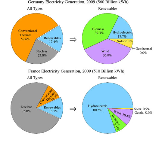
The pie charts show the electricity generated in Germany and France from all sources and renewables in the year 2009.
Summarise the information by selecting and reporting the main features and make comparisons where relevant.
Write at least 150 words.

IELTS Sample Pie Chart - Electricity Generation
SUGGESTED ANSWER:The pie charts illustrate the electricity production in Germany and France in 2009, displaying data on total electricity generated and a breakdown of renewable sources.
In Germany, conventional thermal was the dominant source, contributing 56% of the total electricity generated, while nuclear energy accounted for 23%. Renewables made up 17.4% of the total, with biomass 39.3% and wind 36.9% being the primary contributors. Hydroelectric and solar energy accounted for smaller proportions, at 17.7% and 6.1%, respectively.
In contrast, France relied heavily on nuclear power, which constituted 76% of its electricity production. Conventional thermal was the smallest contributor at 10.3%, while renewables accounted for 13.7%. Within the renewables sector, hydroelectric power dominated, making up 80.5%. Wind energy and biomass represented 10.5% and 8.1%, respectively, while solar energy contributed only 0.9%.
Overall, the data reveal significant differences between the two countries' energy strategies. Germany relied more on conventional thermal and had a diverse mix of renewable sources, while France was predominantly dependent on nuclear power, with hydroelectric being the primary renewable source. These differences reflect each country’s available resources and energy policies in 2009.
COMMON MISTAKES TO AVOID WHEN REPORTING DATA:
Grammar and Sentence Structure
Common Issues:
- Awkward Phrasing:
- Wrong: “German has a huge percentage of conventional thermal almost a 60%.”
- Right: “Germany’s conventional thermal power accounts for nearly 60%.”
- Subject-Verb Agreement and Article Usage:
- Wrong: “German has...” (incorrect subject)
- Right: “Germany has...” (correct subject)
- Ensure proper use of articles (“the”, “a”, “an”) in your sentences.
Strategy:
- Break long or complex sentences into shorter, clearer ones.
- Read your sentences aloud to check for natural flow and correctness.
Vocabulary and Word Choice
Common Issues:
- Informal Language:
- Wrong: “France prefers using nuclear energy with a usage of 76%.”
- Right: “Nuclear power accounts for 76% of France’s electricity generation.”
- Repetitive Expressions:
- Wrong: Repeated use of “we find” or “has a huge percentage.”
- Right: Vary your expressions—use “the data indicate” or “it is observed that.”
- Technical Terminology:
- Wrong: “hydroelectric” when referring to electricity generation in a general sense.
- Right: “hydropower” is more precise when discussing the energy produced by water.
Strategy:
- Build a vocabulary list of formal expressions.
- Replace informal phrases with academic alternatives (e.g., “the data indicate” instead of “we can see”).
Data Presentation
Common Issues:
- Vague References:
- Wrong: “Germany only uses 18% of it.”
- Right: “Wind energy accounts for 18% of Germany’s renewable energy mix.”
- Inconsistent Numerical Formatting:
- Wrong: Using “KWh” or inconsistent percentage formats.
- Right: Always use “kWh” and consistent percentage symbols (e.g., “18%”).
Strategy:
- Clearly link numerical data to the corresponding energy source.
- Use precise language: instead of “a quarter of the spending,” say “approximately 25% of the total.”
Tone and Formality
Common Issues:
- Overuse of Personal Pronouns:
- Wrong: “First we can see all types of sources…”
- Right: “Initially, the chart displays all types of sources…”
- Conversational Language:
- Wrong: “we can see” or “in reverse.”
- Right: Replace with more formal alternatives like “it can be observed that” or “the data indicate that.”
Strategy:
- Replace personal expressions with impersonal alternatives:
- Personal: “We can see that…”
- Impersonal: “It can be observed that…” or “The data indicate that…”
- Practice rewriting sentences to remove “I” and “we.”
Special Focus – Avoiding Personal Pronouns
Why It Matters:
- IELTS Writing Task 1 expects a formal, academic tone.
- Overuse of personal pronouns makes your report appear subjective.
Common Examples:
- Personal: “In the first pie chart we find…”
- Impersonal: “The first pie chart shows…”
- Personal: “We can see that France prefers…”
- Impersonal: “It is evident that France prefers…”
Strategies to Avoid Personal Pronouns:
- Identify and Replace:
- Scan your text for “I” and “we” and substitute with phrases like “the chart indicates” or “the data reveal.”
- Focus on the Data:
- Center your sentences on the information presented rather than on personal observation.
- Example: Change “We can observe that…” to “It can be observed that…”
- Practice Rewriting:
- Exercise:
- Original: “We find that Germany uses conventional thermal power most extensively.”
- Revised: “The data indicate that conventional thermal power is the predominant source in Germany.”
Tips for IELTS Writing Task 1 Success
- Understand the Task:
- Clearly describe and compare data.
- Use Precise Language:
- Avoid vague terms and personal pronouns.
- Organize Your Report:
- Structure your response with an introduction, overview, details, and conclusion.
- Proofread:
- Always check for grammar, punctuation, and style errors.
- Practice Impersonal Writing:
- Rework sentences to maintain an academic tone and objective style.
ACTIVITY: Instructions
- Read each of the following personal sentences carefully.
- Rewrite each sentence in an impersonal form:
- Avoid using personal pronouns such as "I," "we," or "our."
- Focus on the data or observation instead of personal opinion.
- Work individually or in pairs, then discuss your answers as a class.
- Compare your answers with your classmate.
Personal Sentences
- Sentence
1:
"We can see that Germany generates most of its electricity from conventional thermal power." - Sentence
2:
"I believe that France relies heavily on nuclear energy." - Sentence
3:
"We find that renewables are used very little in both countries." - Sentence
4:
"Our analysis shows that wind and biomass are the major renewable sources." - Sentence
5:
"We have observed that solar energy is not significantly used."
Avoiding Personal Pronouns [IELTS Writing]
A VIDEO THAT MAY HELP YOU RECAP! -
SPEAKING:
You can see here, how to change the Report in the previous writing Task from written language, into spoken language:
<<The pie charts illustrate the electricity production in Germany and France in 2009, displaying data on total electricity generated and a breakdown of renewable sources. In Germany, conventional thermal was the dominant source, contributing 56% of the total electricity generated, while nuclear energy accounted for 23%. Renewables made up 17.4% of the total, with biomass 39.3% and wind 36.9% being the primary contributors. Hydroelectric and solar energy accounted for smaller proportions, at 17.7% and 6.1%, respectively. In contrast, France relied heavily on nuclear power, which constituted 76% of its electricity production. Conventional thermal was the smallest contributor at 10.3%, while renewables accounted for 13.7%. Within the renewables sector, hydroelectric power dominated, making up 80.5%. Wind energy and biomass represented 10.5% and 8.1%, respectively, while solar energy contributed only 0.9%. Overall, the data reveal significant differences between the two countries' energy strategies. Germany relied more on conventional thermal and had a diverse mix of renewable sources, while France was predominantly dependent on nuclear power, with hydroelectric being the primary renewable source. These differences reflect each country’s available resources and energy policies in 2009.>>
Script:
<<Good morning, everyone.
Today, I will present an analysis of electricity generation in Germany and France in 2009, as shown by these pie charts. The charts display data on overall electricity production and the share of renewable energy sources.
In Germany, conventional thermal power was the main source of electricity, making up 56% of total production. Nuclear power contributed 23%, and renewables accounted for 17.4%. Within the renewable category, biomass and wind were the major contributors, at about 39.3% and 36.9% of the renewable share, respectively. Hydroelectric power and solar energy played smaller roles, at 17.7% and 6.1%.
In France, the energy mix was very different. Nuclear power dominated, providing 76% of total electricity, while conventional thermal power made up only 10.3%, and renewables accounted for 13.7%. In the renewable sector, hydroelectric power was the leading source, representing 80.5% of renewables. Wind and biomass contributed 10.5% and 8.1%, respectively, with solar energy at just 0.9%.
These figures show clear differences in the two countries’ energy strategies. Germany uses a balanced mix of conventional and renewable sources, while France relies mainly on nuclear power, with hydroelectricity as the key renewable source.
Thank you for your attention. I am now happy to answer any questions you may have.>>
Below are some practical tips for transforming a written report into a spoken presentation:
Simplify Your Language:
- Use shorter sentences and simpler vocabulary to make your speech easier to follow.
- Replace formal written constructions with more conversational phrases (e.g., “Now, let’s look at…” rather than “The following data indicates…”).
Add Signposting and Transitions:
- Include phrases such as “firstly,” “in contrast,” and “to sum up” to guide your audience through your points.
- Use transitional words to clearly mark changes between sections (e.g., “Moving on to…” or “Next, I will discuss…”).
Incorporate Pauses and Emphasis:
- Plan natural pauses for effect and to give your listeners time to absorb key information.
- Emphasize important figures or trends by varying your tone and volume.
Engage with Your Audience:
- Use a friendly yet professional tone and consider occasional personal pronouns if appropriate, to make the presentation more relatable.
- Ask rhetorical questions or include brief remarks that invite reflection (e.g., “Isn’t it interesting how…”).
Practice and Adjust:
- Read your script aloud several times to ensure it sounds natural.
- Adjust pacing and intonation based on practice runs to ensure clarity and engagement.
Structure Your Presentation:
- Start with a brief introduction that outlines the purpose of the presentation.
- Organize the content logically and conclude with a summary of key points and an invitation for questions.
These strategies will help you convert a formal written report into a clear, engaging, and professional spoken presentation.
PRACTICE TIME:
Now, it’s time to practice some speaking. For that, we are going to prepare groups of students, you are going to arrange information in one of the following ideas based in real world situations, you need to gather the information into pie charts and then, present it in class! To get in the mood it may help you thinking you work for a company that has requested of you to present a report in any of these situations below!
_ More specific instructions in the Speaking Task.
Here are several examples of real-world data that can be used in class for interpreting pie charts and other data visualizations:
1. Market Share of Companies: Use data showing the market share of major companies in an industry, such as smartphones or soft drinks. For example, a pie chart could represent the share of Apple, Samsung, Google, and other companies.
2. Population Distribution by Age: Present a pie chart illustrating the age distribution of a country's population. This can show the percentage of children, working-age adults, and seniors, providing insights into demographic trends.
3. Budget Allocation: Use a pie chart to represent how a school's budget is allocated across various departments (e.g., academics, sports, arts, maintenance). This can help students understand financial decision-making in educational settings.
4. Voting Preferences: Analyze data from a recent election showing voter preferences among different political parties. A pie chart could illustrate the percentage of votes each party received.
5. Food Consumption: Show a pie chart depicting the average food consumption of a population by category (e.g., fruits, vegetables, grains, proteins, sweets). This can lead to discussions about nutrition and dietary habits.
6. Energy Sources: Present data on a country's sources of energy production (e.g., fossil fuels, renewable energy, nuclear). A pie chart can illustrate how each source contributes to the total energy mix.
7. Social Media Usage: Use statistics about the percentage of users on different social media platforms, such as Facebook, Instagram, Twitter, and TikTok, to analyze trends in digital communication.
8. Global Water Usage: Show a pie chart representing global water usage by sector (e.g., agriculture, industry, domestic use). This can help students understand environmental issues related to water resources.
9. Transportation Preferences: Use data on how people commute (e.g., car, public transport, cycling, walking) in a specific city. A pie chart can illustrate the breakdown of these transportation modes.
10. Charitable Donations: Analyze data on how donations are distributed among various causes (e.g., education, health, environment, animal welfare). A pie chart can show which causes receive the most support.
Below are several reliable and accessible sources where students can find real-world data for creating pie charts and interpreting market share or similar data:
Statista
A comprehensive portal with a variety of statistics on market share, consumer trends, and more. Many datasets are available for free, while others might require a subscription.
https://www.statista.com/Data.gov
The U.S. government’s open data portal, offering a wide range of datasets related to business, economics, and public trends.
https://www.data.gov/OECD Data
Provides economic statistics and data visualizations for OECD member countries, which can be useful for international market comparisons.
https://data.oecd.org/World Bank Data
Features global economic data and indicators that can help in understanding broader market trends and country-level insights.
https://data.worldbank.org/Google Dataset Search
A tool designed to help locate publicly available datasets on a wide range of topics including market share, economic data, and more.
https://datasetsearch.research.google.com/
META CHART GENERATOR
FURTHER CONSIDERATIONS WHEN DELIVERING PRESENTATIONS! IT'S ALL ABOUT THE CONTEXT AND THE PURPOSE!
DID YOU KNOW THAT STORYTELLING CAN BE A POWERFUL TOOL TO DELIVER PRESENTATIONS?
STAY WIRED AND WATCH THESE VIDEOS FOR STARTERS! -
 PRESENTATION 1PRESENTATION 2


Key Vocabulary Words and Expressions on the video:
- Stakeholders: Stakeholders are individuals or groups with an interest or concern in a business or project. They can be internal, such as employees and executives, or external, such as clients and investors. For example, in a research project, stakeholders might include the research team, sponsors, and the intended audience of the research findings. Understanding who the stakeholders are ensures that their needs and expectations are considered throughout the project.
- Research Objectives: Research objectives are specific goals that a study aims to achieve, guiding the direction of the research. They help in focusing the study by outlining what the researcher wants to find out. For instance, a research objective might be to determine the impact of a new marketing strategy on sales growth. Clearly defined research objectives ensure that the study remains focused and relevant.
- Data Visualization: Data visualization is the graphical representation of information and data using visual elements like charts, graphs, and maps. It helps in understanding trends, patterns, and insights in the data. An example is using a bar chart to show sales growth over time, making it easier to identify trends. Effective data visualization can simplify complex data sets, making them accessible and actionable.
- Infographics: Infographics are visual representations of information, data, or knowledge intended to present complex information quickly and clearly. They combine images, charts, and minimal text to provide an easy-to-understand overview of a topic. For example, an infographic might illustrate the steps of a research process using icons and brief descriptions. Infographics are a powerful tool for communicating information in an engaging and efficient manner.
- Actionable Insights: Actionable insights are conclusions drawn from data analysis that can be acted upon to improve outcomes or make informed decisions. They go beyond mere data points to suggest specific actions. For instance, if data shows a decline in customer satisfaction, an actionable insight might be to enhance customer service training. Providing actionable insights helps translate data into practical strategies.
- Research Methodology: Research methodology refers to the systematic plan for conducting research, detailing the methods and techniques used to collect and analyze data. It ensures the research is valid and reliable. An example of research methodology is using surveys to gather quantitative data from a specific population. A well-defined methodology is crucial for achieving credible and reproducible research results.
- Visual Appeal: Visual appeal refers to the attractiveness of a presentation or document, making it engaging and easy to follow. It involves the use of design elements like color, layout, and typography. A report with a clean, organized layout and vibrant colors is more likely to capture attention and convey its message effectively. Enhancing visual appeal can improve comprehension and retention of information.
- Compelling Presentation: A compelling presentation captures the audience's attention and effectively communicates the intended message. It combines clear content, engaging visuals, and confident delivery. An example is a presentation that uses storytelling techniques and interactive elements to engage the audience. Compelling presentations are essential for persuading and informing audiences in academic and professional settings.
- Research Respondents: Research respondents are individuals who participate in a study, providing the data needed for analysis. They are selected based on specific criteria relevant to the research objectives. For example, in a study on consumer behavior, respondents might be selected based on their purchasing habits. Choosing the right respondents is critical for obtaining valid and relevant research findings.
- Research Findings: Research findings are the outcomes of a study, presenting the data and insights gathered during the research process. They form the basis for conclusions and recommendations. An example of research findings might be a report showing a correlation between social media use and brand loyalty. Clearly communicated research findings are essential for informing decision-making and guiding future research.
Multiple Choice Questions
1. What is the first step in ensuring successful research outcomes according to the reference material?
a) Conducting preliminary surveys
b) Aligning with key stakeholders and SE Suite Executives
c) Designing infographics
d) Collecting data from respondents
2. Why is it important to set expectations before starting a research project?
a) To ensure everyone is on the same page
b) To reduce the cost of the project
c) To increase the number of respondents
d) To simplify data collection methods
3. What should be avoided in research presentations to ensure clarity?
a) Infographics
b) Jargon and unnecessary information
c) Actionable insights
d) Summary of results
4. Which of the following is a key component of a research presentation?
a) Detailed financial analysis
b) Project overview and research objectives
c) Competitive market analysis
d) Historical data trends
5. How should data be presented to make it compelling?
a) With complex charts and graphs
b) In a visually appealing and simple manner
c) Using extensive textual descriptions
d) Through lengthy presentations
6. What is the role of infographics in data presentation?
a) To provide detailed statistical analysis
b) To visually represent data in an understandable way
c) To replace traditional research methods
d) To lengthen the presentation
7. What should be included in the results presentation to ensure it is actionable?
a) Project overview only
b) Infographics only
c) Actionable recommendations and implications
d) Detailed respondent profiles
8. Why is it important to understand the research respondents?
a) To ensure they are the right targets for the project
b) To increase the number of participants
c) To simplify the research objectives
d) To reduce the cost of research
9. What is the purpose of using a typical flow in presentations?
a) To ensure presentations are lengthy
b) To make the presentation process more complex
c) To structure the presentation effectively
d) To focus solely on data points
10. How can infographics enhance the understanding of data?
a) By replacing all text in the presentation
b) By showing data in the form of pictures
c) By eliminating the need for a summary
d) By increasing the amount of data presented
-
This task has been created for you to upload your presentations.
Activity Instructions: Creating and Presenting Pie Charts
Objective:
In this activity, you will work in groups to create and present pie charts based on real-world data. You will gather information, arrange it into pie charts, and present your findings to the class in a clear and engaging way.
Steps to Follow:
Form Groups:
Divide into small groups (3-4 students per group).Choose a Topic:
Select one of the real-world situations listed below. Think of yourselves as employees preparing a report for a company that requires you to present this data professionally.Research and Gather Information:
Collect data on the chosen topic. You may use real statistics (from reliable sources) or create hypothetical data that is reasonable and relevant. Point out your sources at the end.Create Pie Charts:
Represent your data in pie chart form. You can draw it by hand or use digital tools like Excel, Google Sheets, or Canva.Prepare a Presentation:
Organize a 3–5-minute presentation to explain your pie chart. Include:- A brief introduction to your topic.
- An explanation of the data and the insights it provides.
- A summary of what your chart shows.
Present in Class:
Each group will present their chart and findings to the class. Be prepared to answer questions from your classmates and teacher.
Real-World Situations for Pie Charts:
- Market Share of Companies – Share of major companies in industries like smartphones or soft drinks.
- Population Distribution by Age – Age distribution of a country’s population.
- Budget Allocation – How a school’s budget is divided among different departments.
- Voting Preferences – Voter preferences from a recent election.
- Food Consumption – Average food consumption by category (fruits, vegetables, proteins, etc.).
- Energy Sources – A country’s energy production breakdown (fossil fuels, renewables, nuclear).
- Social Media Usage – Percentage of users on different platforms (Facebook, Instagram, TikTok, etc.).
- Global Water Usage – Water usage by sector (agriculture, industry, domestic).
- Transportation Preferences – How people commute in a city (car, public transport, walking, cycling).
- Charitable Donations – Donations distributed among various causes (health, education, environment, etc.).
Evaluation Criteria:
- Creativity and clarity in creating pie charts.
- Accuracy and relevance of the data.
- Quality of presentation (clarity, structure, and delivery).
- Engagement and ability to answer questions.
Pie Chart Presentation Speaking Rubric
Criteria 4 - Excellent 3 - Proficient 2 - Developing 1 - Needs Improvement Accuracy of Data Interpretation Demonstrates complete and precise understanding of pie chart data; explains all segments with 100% accuracy Explains most pie chart segments correctly with minor inaccuracies Demonstrates partial understanding with several data misinterpretations Significant errors in data interpretation; minimal comprehension of chart Grammar and Language Structure Uses complex grammatical structures with near-native fluency; zero to minimal grammatical errors Employs mostly accurate grammatical structures with few minor errors Demonstrates inconsistent grammatical accuracy; multiple noticeable errors Frequent grammatical mistakes impede communication Vocabulary Usage Utilizes sophisticated, domain-specific vocabulary precisely and appropriately Uses varied and relevant vocabulary with occasional imprecision Limited vocabulary range; repetitive language Minimal vocabulary; relies on basic terms Data Presentation Skills Presents data with exceptional clarity, engaging explanations, and smooth transitions between chart segments Clearly explains most chart segments with logical flow Presents data with some confusion and limited explanation Unclear presentation with minimal coherent discussion of data Fluency and Delivery Speaks with natural rhythm, confidence, and zero hesitations; maintains excellent audience engagement Speaks smoothly with occasional brief pauses; generally maintains audience interest Demonstrates fragmented speech with frequent hesitations Significant difficulties in maintaining coherent speech flow Additional Notes:
- Presentations should be 3-5 minutes in length
- Visual aids (actual pie chart) must be included
- Encourage students to practice beforehand
- Emphasize clear, concise data communication
Sample Answer (Market Share of Companies)
This structured approach should help you and your group confidently prepare, create, and present a comprehensive report using pie charts to analyze real-world data.:
"Good morning, everyone. Today, I will present our analysis of the current smartphone market share. In our report, we focused on the market distribution among three major companies: Apple, Samsung, and Xiaomi, along with a category for other competitors.
As shown in this pie chart, Apple leads the market with a 27% share, followed by Samsung at 23%, and Xiaomi holds almost 14% of the market. The remaining 46% is divided among other smaller companies such as OPPO or VIVO. This distribution indicates that Apple’s strong brand loyalty has helped it secure the largest share, while Samsung benefits from diverse product range, and Xiaomi is gradually expanding its influence in niche segments.
Based on this analysis, we recommend that companies look into strategic partnerships and innovations to capture the untapped segments of the market. Thank you for your attention, and I look forward to discussing any questions you might have."
Now, let's include 'storytelling technique' in the presentation:
Do you see the difference?
Title: Telling the Story of the Smartphone Market
"Good morning, everyone. Imagine walking down the street—what do you see? People engrossed in their smartphones, scrolling through news, texting friends, or streaming videos. Now, have you ever wondered which company dominates this ever-growing market? Today, I will take you on a journey through the world of smartphone market share, exploring the strengths of key players and uncovering insights into their strategies.
Let’s begin with a story. Meet Alex, a university student who recently decided to upgrade his phone. He faced three main choices: an Apple device, a Samsung model, or a Google Pixel. Like Alex, millions of people make this decision every day, shaping the competitive landscape of the smartphone industry.
Now, let’s look at the data. Here’s a visual representation of the current market share. As illustrated in this pie chart, Apple leads with a 27% share, followed closely by Samsung at 23%, while Xiaomi holds almost 14%. The remaining 46% is shared among smaller competitors in which OPPO and VIVO can be found.
What does this tell us? Apple’s strong brand loyalty appeals to various consumer needs, from a tightly integrated ecosystem, and brand prestige. Samsung, on the other hand, thrives on broad product range, and from budget-friendly options to premium devices. Meanwhile, Xiaomi, though holding a smaller share, is steadily making inroads with its focus on software innovation and artificial intelligence features.
So, what’s next for the smartphone market? Our analysis suggests that companies aiming to expand their reach should consider strategic partnerships and invest in cutting-edge innovations, whether in battery life, AI, or seamless user experiences.
And that brings us back to Alex—his final choice? Well, that depends on which company tells the most compelling story through its products. Thank you for your attention. I look forward to discussing any questions you might have."
Data from: https://gs.statcounter.com/vendor-market-share/mobile/worldwide
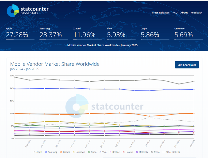
Smartphone Market Share Distribution (as of January 2025):
- Apple: 27.28% oberlo.com+1gs.statcounter.com+1oberlo.com+1
- Samsung: 23.37% gs.statcounter.com
- Xiaomi: 11.96%laureenwreggi.pages.dev+11gs.statcounter.com+11statista.com+11
- Vivo: 5.93% gs.statcounter.com
- Oppo: 5.86%
- Others: 25.60% giacintawemyle.pages.dev
-
The Smartphone Market
-

Description
*This lesson has been updated.
This lesson looks at the language of charts and graphs, specifically nouns, adjectives, adverbs and verbs used to describe the change. Exercises focus on describing charts as well as listening to, and completing the information.
LISTENING ACTIVITY:
-
-
-

HERE YOU CAN DOWNLOAD UNIT 2 PDF FILE
-
QUIZBOT _ MONTY HALL
Unit 2: FACTORIALS AND PERMUTATIONS. MONTY HALL PROBLEM.
Warm-up: Speaking.
1) What do you know about the Monty Hall problem?
2) Do you know any other mathematical assumptions or issues that you may want to share in class?
Follow-up 1: Reading comprehension.
Below is a reading comprehension. The text integrates the Monty Hall problem with key statistical vocabulary. Following the text, you'll find a series of activities to reinforce both the content and language skills.
READING:
The Curious Case of the Monty Hall Problem
Imagine you are a contestant on a popular game show. In this show, there are three closed doors. Behind one door is a shiny new car, and behind the other two are goats. The rules are simple: you choose one door, and then the host, who knows what is behind each door, opens one of the remaining doors to reveal a goat. Finally, you are given the opportunity to stick with your original choice or switch to the other unopened door.
At first glance, it might seem that there is a fifty-fifty chance of winning the car since only two doors remain. However, this is where the Monty Hall problem—a well-known probability puzzle—challenges our intuition. In fact, if you switch doors, your chance of winning the car increases to two-thirds.
This result is counterintuitive, and it is rooted in the concept of conditional probability. Initially, when you choose a door, there is a one-third probability that the car is behind that door and a two-thirds probability that the car is behind one of the other two doors. When the host reveals a goat behind one of these doors, the two-thirds chance does not vanish; rather, it is transferred entirely to the remaining door. Thus, by switching, you are more likely to win.
Let’s break down some of the key vocabulary used in this problem:
- Probability: The likelihood of an event occurring. In our example, the chance of picking the door with the car is a probability.
- Contestant: A person who participates in the game show.
- Host: The person who runs the show and reveals information; in this case, the host opens a door that hides a goat.
- Outcome: The result of an action or event. For example, the outcome can be either winning the car or ending up with a goat.
- Conditional probability: The probability of an event occurring given that another event has already occurred. Here, the chance of winning the car when you switch is a conditional probability based on the host’s action.
- Intuitive: What feels natural or seems obvious, even if it is not mathematically correct.
The Monty Hall problem serves as an excellent example to illustrate how our intuitive judgments can sometimes be misleading when it comes to probability. It is a fascinating topic not only because of its surprising outcome but also because it encourages us to examine the underlying assumptions of statistical reasoning.
In statistical studies and everyday situations, it is important to remember that events can be dependent on previous outcomes. For instance, the fact that the host always opens a door with a goat is not a random occurrence; it is a rule that alters the sample space (the set of all possible outcomes). Such rules help us understand that even in games of chance, our choices can significantly affect the final outcome.
To cut a long story short, Monty Hall problem can be used to explore other statistical ideas, such as the law of large numbers and the concept of expected value. These ideas are crucial for making informed decisions in both academic and real-world situations. Moreover, discussing problems like these can help improve one’s ability to communicate complex ideas in clear and precise English—a key skill in the field of statistics.
Activities:
Activity 1: True/False Questions
- The Monty Hall problem involves choosing one door out of three.
- Initially, the probability of the car being behind the chosen door is two-thirds.
- If the contestant switches their choice after the host opens a door, the probability of winning the car is two-thirds.
- The host’s action of revealing a goat is random.
- Conditional probability plays a significant role in solving the Monty Hall problem.
- The intuitive answer for this problem is that switching does not change the probability of winning.
Activity 2: Vocabulary Matching
Match the following words with their definitions:
VOCABULARY
DEFINITIONS
a. Probability
b. Contestant
c. Conditional
d. Outcome
e. Sample Space1. The set of all possible outcomes of an event.
2. The likelihood or chance that a particular event will occur.
3. A person who takes part in a competition or game.
4. Dependent on a condition or previous event.
5. The result or consequence of an event or action.
Activity 3: Fill in the Blanks
Complete the sentences using words from the vocabulary list above (probability, contestant, outcome, conditional, sample space):
- In a game show, each __________ must decide whether to stick with their initial door choice or to switch.
- The __________ of winning the car increases when the player uses a switching strategy.
- The __________ after the host reveals a goat is that the remaining door has a higher chance of hiding the car.
- The chance of an event happening depends on its __________ context.
- The __________ for this problem includes the car being behind any of the three doors.
Activity 4: Discussion Questions
- Why do you think many people find the result of the Monty Hall problem counterintuitive?
- How does the concept of conditional probability help us understand real-world situations better?
- Can you think of a situation outside of a game show where understanding the sample space might change the outcome of a decision?
Follow-up: Listening.
1) Watch this video in class, pay attention to the explanations and then, try to answer the following questions:
1. The Monty Hall problem demonstrates a difficulty in understanding probabilities when:
(a) The prize is undesirable.
(b) The initial choice is difficult to make.
(c) The base assumptions of the situation change.
(d) The game show host is deceptive.
2. In the Monty Hall problem, after the host reveals a wrong option, switching your choice:
(a) Decreases your chances of winning to 33.3%.
(b) Keeps your chances of winning at 50%.
(c) Increases your chances of winning to 66.6%.
(d) Guarantees you will win the prize.
3. Why does the 100-curtain example make the Monty Hall problem more intuitive?
(a) It simplifies the probability calculation.
(b) It highlights the low probability of the initial guess being correct.
(c) It removes the element of chance entirely.
(d) It makes the host's actions seem less arbitrary.
4. The video criticizes the example of Nash Equilibrium in "A Beautiful Mind" because it is:
(a) Mathematically inaccurate.
(b) Too complex for a general audience.
(c) Needlessly sexist and insulting.
(d) Irrelevant to the film's plot.
5. At its simplest form, the Nash equilibrium theory proposes that there exists scenarios where:
(a) All participants benefit equally, regardless of strategy.
(b) All participants have an incentive to change their strategies.
(c) Competing participants who know the optimal strategies of all other participants have no incentive to unilaterally change their own standing in order to win an advantage over the others
(d) One participant always wins at the expense of others.
6. In the car analogy illustrating Nash equilibrium, the universal binary choice is:
(a) Both cars continue straight.
(b) Both cars swerve in the same direction.
(c) Both cars swerve in opposite directions.
(d) One car stops while the other proceeds.
7. The example of driver education and roadway conventions highlights the importance of:
(a) Individual freedom on the road.
(b) Public awareness of ideal strategies for shared success.
(c) The superiority of larger vehicles.
(d) A competitive driving environment.
8. The video suggests that Rogue States are a greater concern regarding nuclear weapons because:
(a) They are more likely to use them preemptively.
(b) They are less predictable and less likely to adhere to established strategies.
(c) They have more advanced nuclear technology.
(d) They are more likely to share nuclear technology with other countries.
9. Induced demand theory, as mentioned in the video, suggests that adding lanes to a highway:
(a) Always reduces traffic congestion.
(b) Has no impact on traffic patterns.
(c) Actually creates worse traffic problems.
(d) Only helps during peak hours.
10. The Soviet Union abandoned further testing of tritium bombs because:
(a) They were too expensive to develop.
(b) They violated international treaties.
(c) They realized there was no theoretical limit to the payload size of a tritium bomb and this would upset the Nash equilibrium of the nuclear powers.
(d) They were technologically inferior to American bombs.
11. Eugene Wigner's "unreasonable effectiveness of mathematics" refers to:
(a) The complexity of mathematical equations.
(b) The surprising accuracy of mathematics in describing the physical world.
(c) The limitations of mathematical models.
(d) The difficulty of understanding mathematical concepts.
12. Wigner argues that there's no fundamental reason why:
(a) Mathematics should be so difficult to learn.
(b) Mathematical laws should change over time.
(c) The constants and laws of the universe should be possible to express in written formulas.
(d) Mathematics should be applicable to all fields of study.
13. The color red thought experiment illustrates the problem of:
(a) The subjective nature of sensory experiences.
(b) The objective reality of physical phenomena.
(c) The limitations of scientific instruments.
(d) The universality of human perception.
14. Richard Hamming suggests that some scientific discoveries originated from:
(a) Purely mathematical reasoning, later confirmed by observation.
(b) Accidental observations in the real world.
(c) Government funding for scientific research.
(d) Collaborative efforts between scientists.
15. Galileo's law of falling bodies was, according to the video, proven through:
(a) Real-world experiments with precise measurements.
(b) Imagined, controlled scenarios and mathematical reasoning.
(c) Ancient Greek philosophical principles.
(d) Observation of natural phenomena over long periods.
16. The video suggests that experiments proving mathematical laws are often imperfect because:
(a) They are subject to human error.
(b) Real-world conditions can never be perfectly controlled.
(c) Mathematical equations are inherently flawed.
(d) Scientific funding is often inadequate.
17. Einsteinian physics demonstrated that:
(a) Newtonian physics was completely wrong.
(b) Newtonian physics was incomplete.
(c) Quantum physics was unnecessary.
(d) Mathematics was irrelevant to physics.
18. Schrodinger's cat illustrates the idea that:
(a) Cats are unpredictable creatures.
(b) Quantum mechanics is easily understood.
(c) Reality at the quantum level can be paradoxical.
(d) Experiments always confirm mathematical predictions.
19. The video concludes that for most daily purposes:
(a) Abstract mathematical concepts are essential.
(b) The human brain understands reality without complex mathematics.
(c) Newtonian physics is irrelevant.
(d) Quantum physics governs our everyday experiences.
20. According to the video, even if maths isn't real:
(a) We should abandon scientific inquiry.
(b) Everything is going to be fine.
(c) We should focus on practical applications of science.
(d) The universe is fundamentally chaotic.Follow-up 4: Learning the specific Language _ PDF Presentation on Campus.

How to Read these Mathematical Operations in English:
Factorials and Permutations
"n!" is read as "n factorial."
"kPn" is read as "permutations of k out of n" or "n permute k."
Example: "6!" is read as "six factorial," which means "six times five times four times three times two times one."
The formula for permutations: is read as: "The number of permutations of k objects out of n is equal to n factorial divided by the factorial of n minus k."
Example: is read as: "Permutations of four out of six is equal to six factorial divided by two factorial."
Monty-Hall Problem
Suppose you’re on a game show, and you’re given the choice of three doors: Behind one door is a car; behind the others, goats. You pick a door, say No. 1, and the host, who knows what’s behind the doors, opens another door, say No. 3, which has a goat. He then says to you, “Do you want to pick door No. 2?” Is it to your advantage to switch your choice?
A car and two goats are arranged behind three doors, with the position of the car being random and uniformly distributed among the three doors, and then the player initially picks a door. Assuming the player’s initial pick is Door 1 (the same analysis applies for any other door the player picks), then according to the problem statement in which the host must always open a door after the player chooses one, then there are three equally likely cases:
• The car is behind Door 3 and the host must open Door 2: Probability = 1/3
• The player originally picked the door hiding the car. The game host must open one of the two remaining doors randomly, so there are two subcases
– The car is behind Door 1 and the host opens Door 2: Probability = 1/6
– The car is behind Door 1 and the host opens Door 3: Probability = 1/6
• The car is behind Door 2 and the host must open Door 3: Probability = 1/3
These cases and the total probability of each of them occurring are shown in the figure below. If the host has opened
Door 3 switching wins in the 1/3 case where the car is behind Door 2 and loses in one 1/6 subcase where the car is behind
Door 1, hence switching wins with probability 2/3.
Monty Hall Problem (how to read these numbers / operations in English):
"1/3" is read as "one-third."
"2/3" is read as "two-thirds."
Probability statements:
"The probability that the car is behind door 3 is one-third."
"Switching doors increases the probability of winning to two-thirds."
Classwork:
1. A group of 6 club members always dine at the same table in the club; there are exactly 6 chairs at the table. They decided that each day, they want to seat in a different order. Can they keep this for a year? Two years?
2. How many ways are there to seat 15 students in a classroom which has 15 chairs? If the room has 25 chairs?
3. A small theater has 50 seats. One day, all 50 seats were taken – but the people took seats at random, paying no attention to what was written on their ticket.
a. What is the probability that everyone was sitting in the right seat (i.e., the one written in his ticket)?
b. What is the probability that no person was sitting in the right seat?
4. A puzzle consists of 9 small square pieces which must be put together to form a 3 × 3 square so the pattern matches (this kind of puzzles is actually quite hard to solve!). It is known that there is only one correct solution. If you started trying all possible combinations at random, doing one new combination a second, how long will it take you to try them all?
5. a. How many 5s are there in the prime factorization of the number 100!? How many 2s?
b. In how many zeroes does the number 100! end?
6. 10 people must form a circle for some dance. In how many ways can they do this?
7. Here is another question similar to the Monty Hall question discussed today. You know that the family next door has two children. You met one of them, and he is a boy. What is the probability that the other one is a boy, too?
-
1.2 MB documento PDF 上传 2025年03月12日 15:11
-
-
-
Is Music Stardom in Decline? A Statistical Analysis Is music stardom dying?
ACTIVITIES:
Intro: The Billboard Charts, Then and NowEvery artistic medium has a widely accepted marker of commercial success. Movies have box office receipts; TV has the Nielsen ratings; music has the Billboard Charts. Yet Billboard's status as a yardstick for popular music is surprising when you consider the publication's origins.
Billboard Magazine was first published in 1894. Originally named "Billboard Advertising," it was founded to be a trade publication for the bill posting business, a common form of street advertising at the time—hence the name Billboard.
The magazine's early focus had nothing to do with music and mainly covered topics like:
Bill posting industry news (I don't really know what this means)
Traveling fairs and carnivals
Circuses and other outdoor amusements
Over time, Billboard slowly moved away from street advertisement in favor of music culture:
In 1913, Billboard began tracking sheet music sales.
In the 1920s, the magazine began covering radio.
In the 1940s, Billboard introduced its first music charts, tracking pop, rhythm & blues, and country.
Finally, in 1958, the publication launched the "Billboard Hot 100," a weekly ranking of America's most popular songs based on aggregated data from album sales and radio airplay.
The Hot 100 quickly became the industry standard for tracking hit songs and has remained so for over six decades despite various changes in music distribution.
But Billboard is far from perfect. In 2023, the outlet's online publication, Billboard.com, caused a minor stir by publishing an article titled "Why Aren't More Pop Stars Being Born?" This article is more provocative than empirical, a confusingly unscientific effort from a magazine with ample data to ask and answer its own questions. Quotes referenced in this piece argue that music stardom is dead, blaming a cavalcade of usual suspects: TikTok, Spotify, the fall of radio, video games, record labels, and Taylor Swift.
I couldn't help but question the validity of these claims, especially if one were to fact-check this article with Billboard Hot 100 data. So today, we'll investigate whether music stardom is "dying," what might be driving this phenomenon, and whether tracking cultural celebrity has any greater meaning (or is just navel-gazing nonsense).
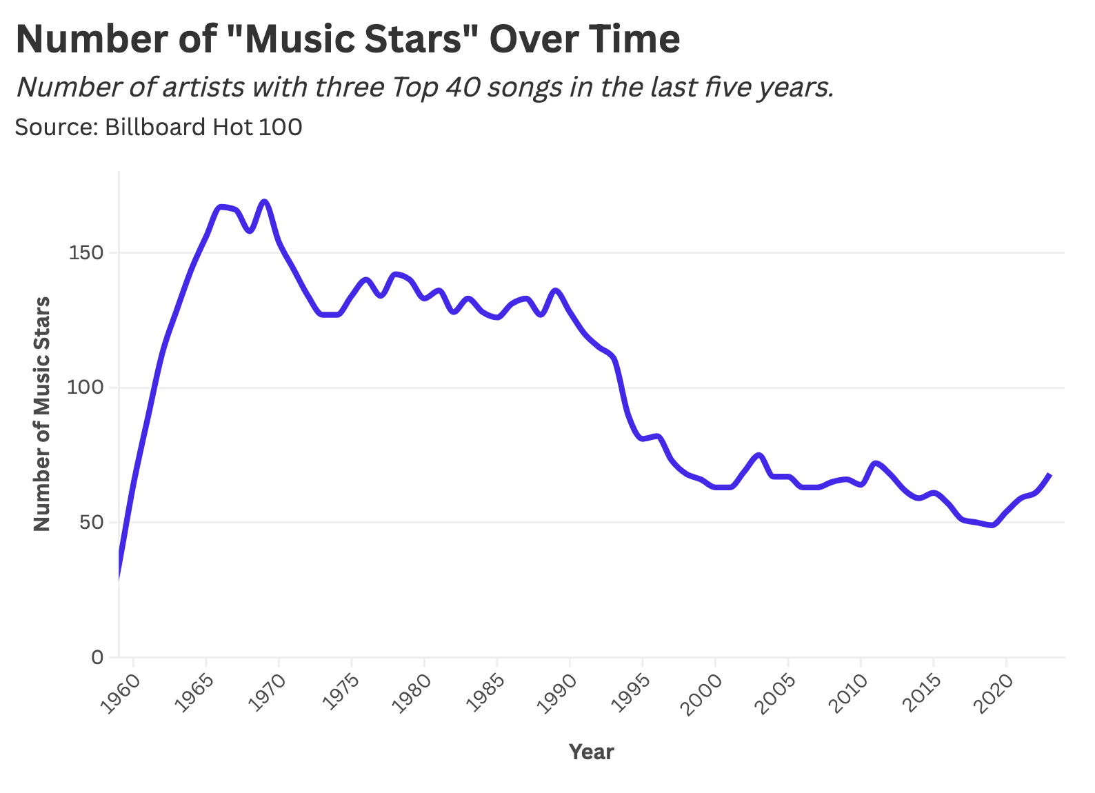
Are There Fewer Music Stars?
Stardom emerges from a concentration of cultural attention on a single artistic figure. For example, Chappell Roan is a music star because everyone is currently streaming and discussing her music—at least right now. She has captured a disproportionate share of listenership.
To quantify music celebrity, we'll deem someone a "star" if they've had three Billboard Top 40 hits within the past five years (on a rolling basis). To illustrate how this calculation works, we'll investigate ABBA's Billboard history. The Swedish supergroup had two hit songs in 1974 and one Top 40 tune the following year, meaning they earned "star" status in 1975 (according to our definition). ABBA remained a fixture of the Billboard Charts until their breakup in 1982, after which they gradually faded from the mainstream and lost their star status by 1984.
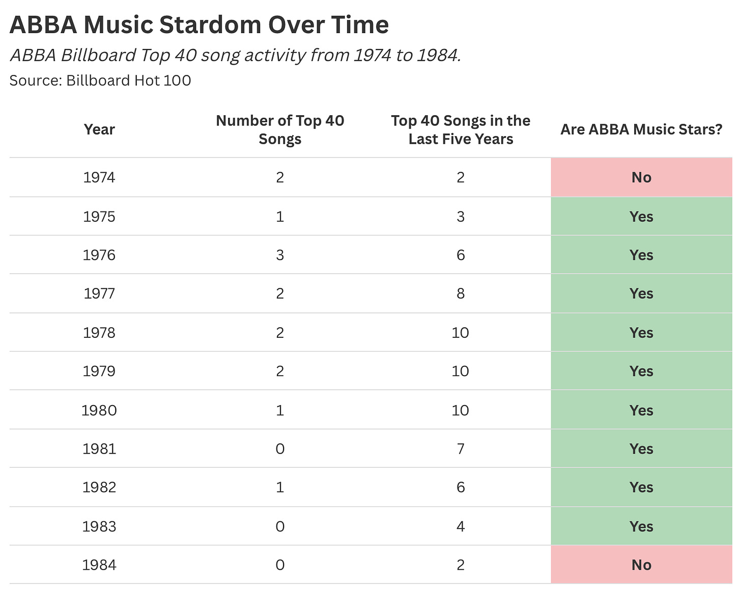
Admittedly, we could tinker with the parameters of this definition (like changing our three-hit threshold to five or ten), but that doesn't meaningfully alter the outcome of our analysis since we're tracking how this metric fluctuates over time.
When we chart the prevalence of music stardom since Billboard's inception, we find a surge of celebrity in the 1960s with the rise of rock, a slight dip in the 1970s, a rapid acceleration of this decline beginning in the early 1990s, and a very slight uptick in recent years likely stemming from the rise of streaming and (gasp) TikTok.
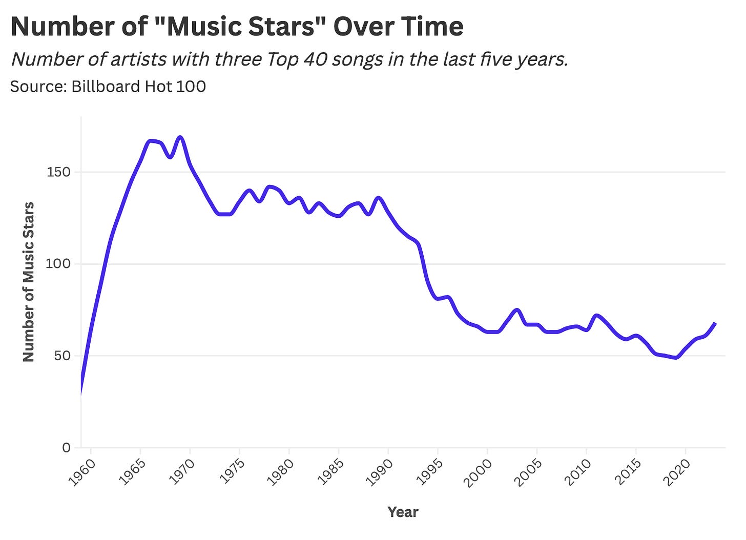
How could this be? Isn't declining music stardom the product of nefarious digital forces like Spotify, TikTok, and Taylor Swift? What happened in the 1990s that led to a drastic dip in Top 40 artists?
Ultimately, declining music celebrity can be attributed to various shifts in music distribution:
Record Label Consolidation: Many industry developments can be explained by mergers and acquisitions (a banal yet impactful economic force). This ever-repeating cycle of corporate development goes something like this:
An upstart label hits it big, or a formidable player stumbles.
A multinational whale like Warner Music or Sony gobbles up that player.
Rinse and repeat until there are no more acquisitions left to be had.
End State: Corporate consolidation yields a small set of labels taking bigger bets on a shrinking pool of mega-stars (i.e., Brittney Spears and NSYNC).
MTV: MTV was the music industry's most visible tastemaker in the 1980s and 1990s. For two decades, a disproportionate share of youth culture flowed through a single TV network. Over time, MTV became a cultural echo chamber capable of minting superstars, funneling air time toward a curated collection of music acts like Madonna, Nirvana, and Alanis Morissette.
Genre Fragmentation and the Internet: In the 1990s, new music categories like rap and hip-hop emerged, while rock splintered into various subgenres such as grunge and alternative. The internet allowed consumers to access and explore niche genres, making it harder for any one artist to achieve broad-based "superstar" status.
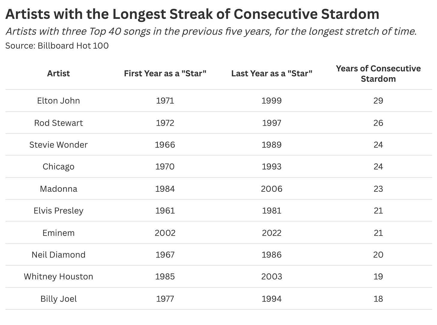
When we look at the artists with the longest consecutive run of music stardom, we find most acts predate the 1990s.
Billboard.com is correct, but only to a certain extent: music stardom is dying, though this phenomenon isn't a recent development. So, if pop celebrity began declining in the 1990s, what cultural forces stopped these declines in recent years? What's the state of the Billboard Charts in the 2020s?
Enjoying the article thus far and want more data-centric pop culture content?Subscribe to Stat Significant for free and receive new data essays every week.
The (Slight) Rebirth of Music Stardom
In December of 2014, Billboard updated its chart methodology to include streaming data alongside traditional album sales. Under this new system, 1,500 song streams would equate to one album sale, a funky heuristic that has continually fluctuated over time.
At a high level, streaming's newfound dominance came at the expense of long-standing industry gatekeepers. MTV and other publications became increasingly irrelevant, and record labels lost their stranglehold over music distribution (now, anyone can publish music online).
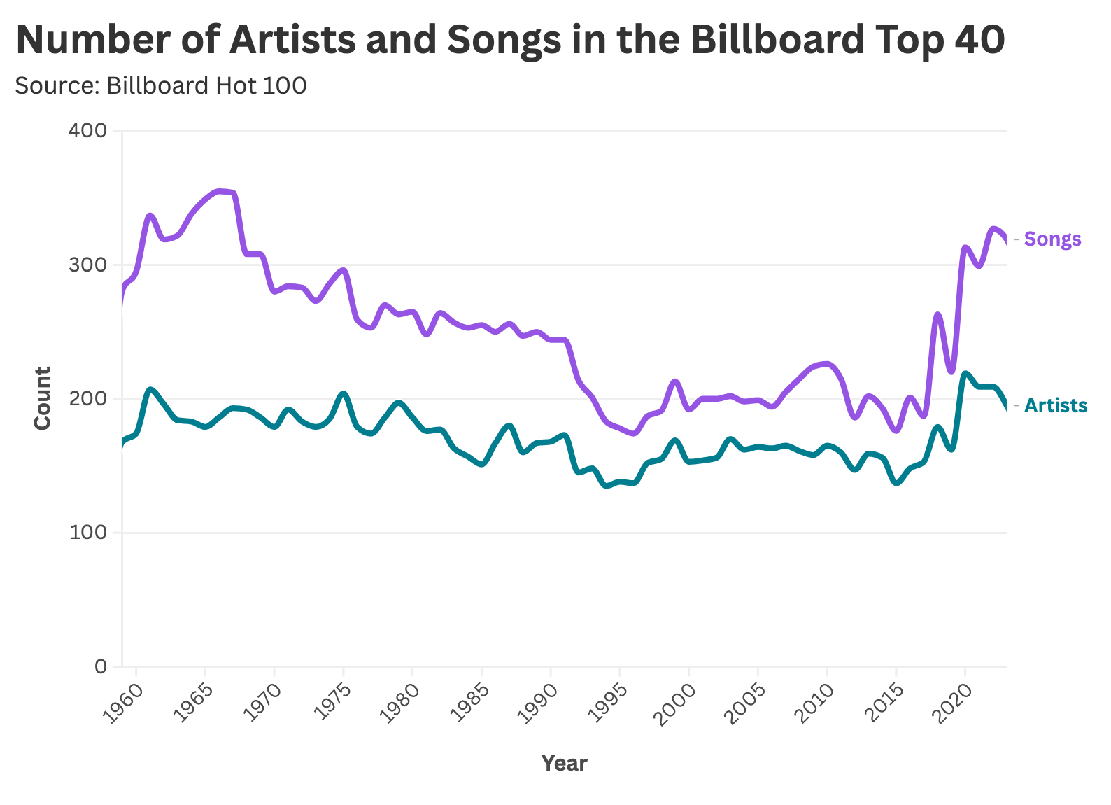
As a result, popular taste would come to be defined by algorithms and playlists—new-fangled products of attention-harvesting streaming platforms. Changes in music distribution and consumption fostered an increasingly democratized industry, with more artists and songs making the Top 40 in a given year.

However, this uptick in trending songs and artists has not yielded a commensurate increase in music stardom (according to our first graphic). How is this possible? The answer is time.
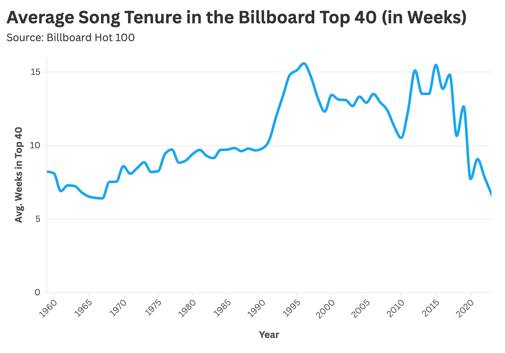
Sure, the Billboard Hot 100 has greater song diversity, but these artists do not possess a similar hold over popular imagination. An artist's average tenure in the Top 40 has meaningfully decreased with Spotify and TikTok's ascendence.
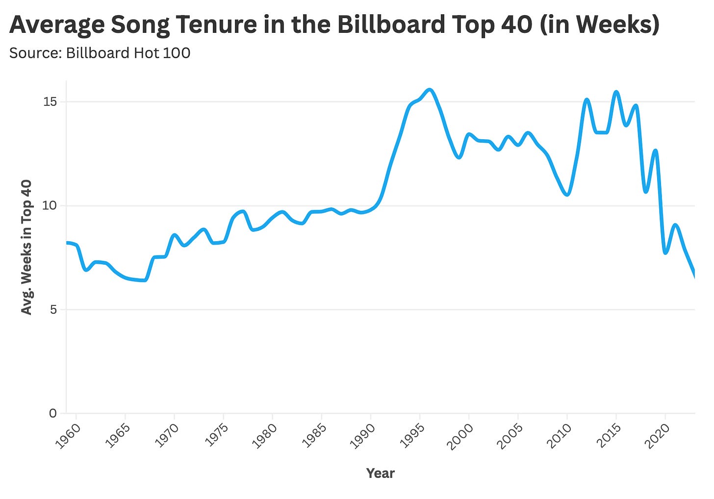
Our cultural attentions have become like that of a goldfish. At this point, we can (once again) return to the Billboard.com article on music celebrity: this piece seemingly confuses declining stardom with decreasing attention spans.
Musicians like The Lumineers or Lorde can invade the zeitgeist and burn bright for a short period of time before mainstream culture moves on to the next big thing—kind of like a traveling circus (the type Billboard would cover circa 1895). The music industry has slightly more "stars" (as of late), but this stardom comes with an ever-shrinking half-life.
Final Thoughts: Consolidation or Democratization?

Why should anyone care about the idolization of commercial music acts? Said differently, do any of these facts and figures matter? Broadly speaking, there is nothing wrong with fewer music stars, given pop stardom is a bizarre construct in the first place. Nobody's life is materially improved when media outlets cover Taylor Swift's every move or fixate on Chappell Roan's tweets.
At the same time, the prevalence of music stardom (and other forms of stardom) serves as a reflection of cultural attention. People can only listen to so much music; there is a fixed set of collective listening capacity within a given year. How this proverbial "pie" of listening hours is divided among musicians shapes the emergence of monocultural figures (or lack thereof) and determines their staying power on the Billboard Charts.
If you care about this stuff (and I wouldn't blame you if you didn't), then the frequency of widely-known music acts presents you with a Rorschach test, where you might favor:
Consolidated Attention and Fewer Stars: Perhaps you miss the good old days of MTV and Brittney Spears when "stars were stars"—when rock groups could remain a fixture of popular culture for decades, like The Rolling Stones or Chicago. You weren't a cultural dinosaur because everyone listened to a smaller set of artists, and you didn't have to learn about some new-fangled music act every other week. Everybody loved Elton John, and it was a simpler time.
Democratized Distribution and More Stars: Why do record labels even exist in the first place? Why were MTV and a small cadre of industry executives the grand arbiters of music taste for so many years? Spotify and social media rid music of unnecessary gate-keeping. Anyone can go viral nowadays, even if that virality only lasts so long.
Every decade or so, the music industry undergoes a major paradigmatic shift in distribution. In the 1960s, fame was defined by radio airtime; today, celebrity can arise from a viral hook becoming the centerpiece of a TikTok dance challenge.
The drivers of music stardom are ever-changing, yet one thing remains certain: nothing lasts forever—not even Elton John or the vaunted bill posting industry.
Thanks for reading Stat Significant! Subscribe for free to receive new posts and support my work.
1. True/False with Evidence
Read the text and decide if each statement is true or false. Then, write down the exact line (or sentence) from the text that supports your answer.
-
Billboard Magazine started as a publication about music.
-
According to the text, a music star is defined as an artist with three Billboard Top 40 hits in the last five years.
-
The text states that the decline in music stardom began in the 1990s.
-
Streaming data has had no effect on how music is measured in recent years.
-
MTV was once a major factor in creating music superstars.
2. Answer the following questions in complete sentences, using evidence from the text where possible.
-
What evidence does the text give to support the idea that music stardom has been changing over time?
-
How did Billboard Magazine’s focus change from its beginning to the present day?
-
In what way is the definition of a “music star” used in the text, and why is it important for statistical analysis?
-
What role did technological changes, such as the advent of streaming and TikTok, play in the evolution of music stardom?
-
Discuss the impact of record label consolidation on the number of music stars according to the text.
3. Select the correct answer for each question.
-
What was the original focus of Billboard Magazine?
A) Music reviews
B) Street (billboard) advertising
C) Sports events
D) Political news -
When was the Billboard Hot 100 launched?
A) 1894
B) 1913
C) 1958
D) 2014 -
Which of the following changes did NOT contribute to the decline of long-term music stardom?
A) Record label consolidation
B) The rise of MTV as the sole tastemaker
C) Genre fragmentation and niche exploration via the Internet
D) The inclusion of streaming data in ranking songs -
What does the term “rolling basis” refer to in the context of the text?
A) A method of calculating data over a fixed period that updates regularly
B) A type of music distribution
C) A method of advertising on the streets
D) None of the above
4. Fill in the Gaps (Vocabulary & Grammar)
Complete the sentences by filling in the missing words. Use the vocabulary from the text where possible.
-
Billboard Magazine was originally a publication about __________ advertising.
-
The introduction of the Billboard __________ 100 in 1958 marked a new way to rank popular songs.
-
The text defines a music star as an artist with three Top 40 hits in the past __________ years.
-
Changes in music __________, such as the rise of streaming and social media platforms, have influenced stardom.
-
The analysis shows a clear __________ in music stardom starting in the early 1990s.
5. Speaking Practice (Pair/Group Work)
Partners or small groups (2–3 students) should discuss the following topics, using evidence and vocabulary from the text.
- Topic 1: Discuss whether you agree that digital platforms (like TikTok and Spotify) have shortened the lifespan of a music star. Support your opinion with examples from the text.
- Topic 2: How has the method of measuring success in the music industry changed from the early days of Billboard to now? What vocabulary can you use to describe these changes (e.g., metric, data, trend, consolidation)?
- Extension: Role-play a scenario where one student is a record label executive and the other a statistician. Discuss strategies to find and promote new artists based on statistical data.
6. Additional Activities
A. Vocabulary Matching
Match the vocabulary word with its definition.
Word Definition 1. Metric A. Information collected for analysis 2. Data B. A standard or system used to measure or compare something 3. Trend C. A general direction in which something is developing 4. Consolidation D. The process of combining several things into one 5. Distribution E. The way something is spread out or allocated
B. Writing Assignment
Write a short paragraph (about 100–150 words) on the following topic:
"The Role of Statistics in Understanding Music Trends"
In your paragraph, include at least three vocabulary words from today’s lesson (e.g., metric, data, trend, consolidation, distribution). Use evidence from the text to support your ideas.Teacher Note: Encourage students to share their paragraphs with a partner for peer review.
C. Discussion/Debate
In a small group, discuss the following question:
"Has the rise of digital platforms democratized the music industry, or has it diluted the meaning of 'stardom'?"
Teacher Note: Ask each group to summarize their discussion and highlight key vocaActivity 7: Grammar Focus – Verb Tense Identification
Instructions:
Read the following sentences taken directly from the original text. Identify the tense of the bolded verbs and explain why that tense is used in context.- "Billboard Magazine was first published in 1894."
- "Billboard slowly moved away from street advertisement in favor of music culture."
- "In December of 2014, Billboard updated its chart methodology to include streaming data."
Activity 8: Sentence Transformation and Simplification
Instructions:
Rewrite the following complex sentence from the original text in simpler language while retaining its original meaning.Original Sentence:
"Every artistic medium has a widely accepted marker of commercial success. Movies have box office receipts; TV has the Nielsen ratings; music has the Billboard Charts."Task:
Rephrase the sentence in your own words to make it clearer and easier to understand.Activity 9: Gap Filling with Vocabulary and Grammar
Instructions:
Complete the following sentences by filling in the gaps with the correct words from the original text or appropriate vocabulary. Use context clues from the sentence.- Every artistic medium has a widely accepted ________ of commercial success.
- Billboard Magazine was originally called "Billboard ________" and focused on the bill posting business.
- In 1958, the publication launched the "Billboard Hot ________," a ranking of America's most popular songs.
- The new chart methodology introduced in 2014 included streaming data, a heuristic that has continually ________ over time.
TRANSLATION ACTIVITIES:
Activity 1: Vocabulary Translation Matching
Instructions:
Below is a table with important English vocabulary words from the text. Translate each word.English Word/Phrase
1. Stardom
2. Aggregated
3. Empirical
4. Parameters
5. Consolidation
6. Democratized
7. Marker
8. Heuristic
9. Rolling basis
10. Chart methodology
Activity 2: Paragraph Translation
Instructions:
Translate the following paragraph from the original text into your native language. Work individually first, then discuss your version in small groups.Paragraph:
"Billboard Magazine was first published in 1894. Originally named 'Billboard Advertising,' it focused on street advertising and covered topics such as traveling fairs, carnivals, and circuses. Over time, the magazine shifted its focus to music culture, eventually tracking sheet music sales, radio trends, and creating its first music charts in the 1940s."Activity 3: Error Correction in Translation
Instructions:
Below is a translated sentence that contains some mistakes. Identify and correct the errors to make the translation accurate. Assume the target language is Spanish.Incorrect Translation:
"El magazine Billboard fue publicado primero en 1894 y se llamaba originalmente 'Billboard Publicidad', centrándose en la publicidad en la calle y hablando sobre ferias, carnavales, y circos."Task:
- Underline or list the errors in the translation.
- Rewrite the sentence correctly.
Activity 4: Gap-Fill Translation Exercise
Instructions:
Complete the following gaps by filling in the missing words in your translation of the English sentences into your native language (again, assume Spanish as an example). Use context clues and vocabulary from the text.- English: "In 1958, the publication launched
the 'Billboard Hot 100,' a weekly ranking of America's most popular
songs."
Spanish: "En 1958, la publicación lanzó el 'Billboard Hot 100,' una clasificación __________ de las canciones más populares de Estados Unidos." - English: "Changes in music distribution,
such as the rise of streaming, have altered how success is measured."
Spanish: "Los cambios en la __________ de la música, como el auge del streaming, han cambiado la forma en que se mide el éxito." - English: "The methodology was updated to
include streaming data."
Spanish: "La metodología fue actualizada para incluir datos de __________."
The Evolution of Music Stardom: A Statistical Analysis
Key Statistical Terms and Concepts:
- Data Analysis
- Trend Analysis
- Peak Distribution
- Variable Correlation
- Temporal Analysis
- Frequency Distribution
- Market Consolidation
- Statistical Significance
- Demographic Metrics
- Time Series Analysis
Introduction to Billboard Charts Analytics
The Billboard Charts represent a comprehensive statistical framework for measuring musical success through quantifiable metrics. This statistical overview examines the evolution of music stardom through data-driven analysis and trend identification.Methodology and Metrics
Statistical Definition of Stardom:- Primary Variable: Number of Billboard Top 40 hits
- Time Frame: Rolling 5-year periods
- Success Threshold: ≥3 hits within the measurement period ("≥" as "greater than or equal to.") Note: "≤", you would read it as "less than or equal to."
- Data Collection Period: 1960-2024
Statistical Findings
Temporal Distribution of Music Stars:
- Peak Period: 1960s (highest frequency distribution)
- Initial Decline: 1970s (negative trend correlation)
- Secondary Decline: 1990s-present (continued downward trajectory)
- Recent Uptick: 2020s (slight positive correlation with streaming metrics)
Variable Analysis
Market Structure Variables:
- Industry Consolidation Coefficient
- Market Share Distribution
- Platform Diversification Index
Technology Impact Metrics:
- Streaming Platform Analytics
- Social Media Engagement Rates
- Digital Distribution Channels
Statistical Implications
Contemporary Success Factors:
- Platform Algorithm Variables
- Audience Segmentation Metrics
- Content Distribution Statistics
Market Evolution Indicators:
- Decreased Market Concentration
- Increased Artist Population
- Reduced Individual Market Share
Regression Analysis of Success Factors
The data suggests a multivariate relationship between traditional success metrics and modern distribution channels, with significant correlation coefficients between:- Social Media Presence
- Streaming Numbers
- Chart Performance
Conclusion: Statistical Significance
The analysis demonstrates statistically significant changes in the distribution of musical success, with increased variance in achievement metrics but decreased magnitude of individual success markers.Discussion Questions for Statistical Analysis:
- How do we quantify the relationship between streaming metrics and traditional success indicators?
- What statistical methods best measure modern musical success?
- How can regression analysis predict future trends in music stardom?
-
Job Application Language https://kahoot.it/challenge/03560846
Business magazine Job interviews
https://youtu.be/IEl0ORrisBc?si=06vOJolVueiKrLwpDo job interviews stress you out? Do you want help with writing a CV or cover letter in English? In this series, Pippa and Phil take you through every step of getting a job from search, to interview, to your first day. Each episode features advice from a BBC World Service recruitment expert and useful vocabulary tips to help you apply for a job in English.

Text Dependent Questions on Preparing for an Interview:
What is the primary focus of the podcast episode discussed in the text?
- A) Job applications
- B) Interview preparation
- C) Resume writing
- D) Networking strategies
According to Phil, what does he try to do in preparation for an interview?
- A) Write a script
- B) Work out potential questions and answers
- C) Arrive right before the interview starts
- D) Avoid practicing
What does Amy Evans suggest you should research before the interview?
- A) The company’s financial statements
- B) The panel members and their roles
- C) The history of the company
- D) The job market trends
What is one of the main concerns mentioned by Pippa regarding practicing for an interview?
- A) Forgetting important details
- B) Sounding overly rehearsed or robotic
- C) Not having enough examples
- D) Arriving late to the interview
According to Amy, how should candidates practice for interviews?
- A) Only on paper
- B) By memorizing answers
- C) By role-playing with others or practicing in front of a mirror
- D) By writing down their answers
What is emphasized as an important aspect of interview preparation by both Phil and Amy?
- A) Developing a detailed script
- B) Finding the exact wording for answers
- C) Practicing to sound natural and confident
- D) Preparing for unexpected questions only
What logistical preparation does Pippa mention that can help reduce stress on the day of the interview?
- A) Arriving at the venue early
- B) Testing the route to the interview location
- C) Engaging in relaxation techniques
- D) Bringing a friend for support
What does Phil suggest about bringing notes to the interview?
- A) Notes should be memorized
- B) Notes can be used as a script
- C) Notes are unnecessary
- D) Notes can be brought but should not be read like a script
Why is it important to think about potential interview questions in advance, according to the text?
- A) To limit the number of questions asked
- B) To ensure you can answer confidently and naturally
- C) To avoid practicing at all
- D) To memorize every possible answer
What is the overall message of the podcast episode regarding interview preparation?
- A) It is crucial to over-prepare for interviews
- B) Balance between preparation and natural conversation is key
- C) Interviews are always stressful and unmanageable
- D) Practicing only enhances anxiety
https://www.ted.com/talks/priyanka_jain_how_to_make_applying_for_jobs_less_painful?utm_campaign=tedspread&utm_medium=referral&utm_source=tedcomshare
-

<<The purpose of an essay is to present a logical, reasoned argument in response to a specific question. An effective structure helps your argument to unfold clearly to the reader. You want your response to be focussed and progressive, rather than just a jumble of ideas. This guide suggests some ways of planning and structuring your essays.>>
Click on the Link Here to Find out More:
 Academic Essay Structure
Checklist for Academic Essays | Is Your Essay Ready to Submit?
Published on December 2, 2014 by Shane Bryson. Revised on December 6, 2021.
An academic essay is a focused piece of writing that aims to present a convincing argument using evidence, analysis and interpretation. It always has an introduction, a main body, and a conclusion.
When you’ve finished writing your essay, use this checklist to evaluate your work.
Checklist: Essay
0 / 14
-
https://www.indeed.com/career-advice/interviewing/statistician-interview-questions
https://www.mockquestions.com/position/Statistician/
https://youtu.be/hVhUc88KzMg?si=kdHo5orYROHSbppM
[2/4, 17:40] Barbara 芭芭拉: https://www.indeed.com/career-advice/interviewing/statistician-interview-questions
https://himalayas.app/interview-questions/statistician
https://www.mockquestions.com/position/Statistician/
https://youtu.be/hVhUc88KzMg?si=kdHo5orYROHSbppM
-
-

Present Simple Exercises
-
PRESENT SIMPLE OR PRESENT CONTINUOUS ACTIVITIES (CONSOLIDATION):

-
-
-